If you haven't seen the previous two parts you should check those out. If you are one of those people who wants to see the finished product, then wait a day or so. If you are along for the ride, sit back and enjoy!

And I was not happy with the free pieced roses I had made so I stopped at two. As I thought more about the roses themselves, I decided to check out EQ 6 and see if it had some roses to offer. And they did. Mostly applique roses, and I don't really like applique. Gee, this is sounding like I don't like this and don't like that, huh?

Stems:
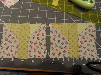
Roses, they look pretty good, don't they!
At least they look good on the cutting mat. There is a good lesson in this here rose. Contrast. I was really concerned about contrast with the letters because I read in Tonya's book (Word Play, by the way) that you have to pay attention to contrast if you want to see your wonderful words. And I listened, but did not generalize. ( I tell my dog clients all the time.......Dogs do not generalize, you have to teach sit in every room in your house!) But did I listen to myself......No.

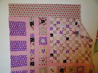
This quilt really wanted to be square. Everything I did, kept making it square. So I tested a few things out on the design wall to see if I could make it "not square" and have it still retain its charm.
Here is an addition on the top:

And here is a test with a leftover square all on the bottom.
It looks kinda good so I will go with the bottom row. I really want that center medallion, as it were, to be on the top corner still. I thought that it should have the divisions with pink, as I had some of the pink polka dots left, enough to make it look like the purple on the side there. I need to fix that left bottom corner, hmmmm, for some reason I dipped when I sewed it together. I wonder how that happened. Here is what it ended up looking like tonight. It measures 51 x 67 so it is not square and I can sleep tonight.
Isn't that funny, it doesn't have to be king sized either! LOL.
glen: I am liking this Not Square Roses Quilt. and here is a rose close if you you can't find them in the quilt. Just make it larger and you can see them in their low contrast paperpieced glory!


Morning Glen - This is looking much better. I like the new roses better than the old ones. The off-set 'center medallion' reminds me of you - the center but just a little off. LOL!!!!!!!!!!!!!!!!!!
ReplyDeleteHugs - Marie
You are even making pink look good. I like the paperpieced roses and I agree quilting will make them stand out more.
ReplyDeleteI like those paper-pieced roses. And with your bottom row, the quilt is no longer square. Good thinking. I'm not crazy about square quilts either because they just don't fit a bed.
ReplyDeleteI enjoyed reading about the development and stages of this quilt. It helps us all learn to watch how a quilter makes decisions as they go along. Great job...love the letters you sewed!
ReplyDeleteroses and quilts were made for one another ;-) cheers
ReplyDeleteGreat post, thanks for sharing.
ReplyDeleteAnd a lovely individual looking quilt!